Edouard Vuillard: Paysages et Intérieurs
A commentary about the historic context and importance of this portfolio can be found at the bottom of this page, below the images.
A printer-friendly pdf of this information can be downloaded here.
Edouard VUILLARD (1868-1940)
Landscapes and Interiors
References: Roger-Marx 31-43; Una Johnson 155.
Only edition of one hundred, printed by Auguste Clot,
and published by Ambroise Vollard, Paris.
Each sheet is approximately: 16 x 12 ½ inches.
Each image is approximately: 14 x 11 inches.
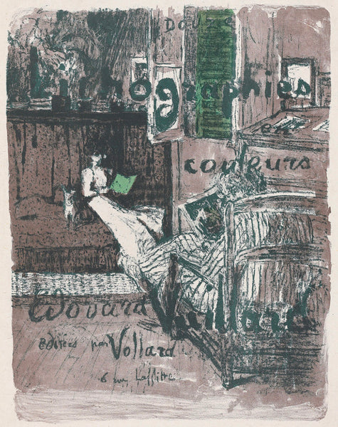
Cover (ENG)
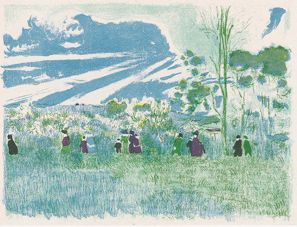
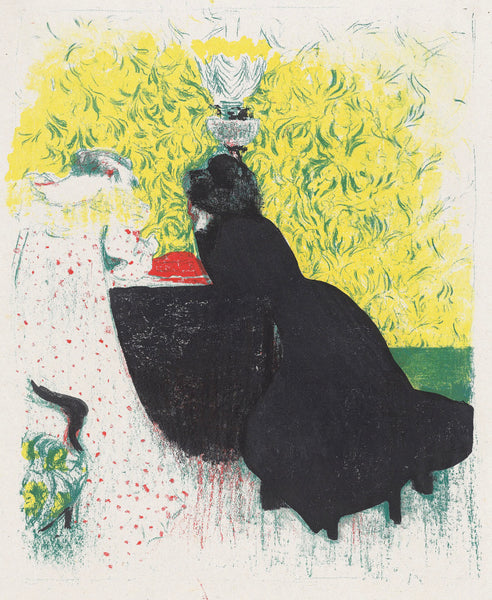
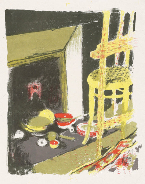
Through the Fields (ENG)
Color in printmaking: we take it for granted today. It was however, until the 19th century, not really an option in Western Arts. And even when the use of color did become available to printmakers, it took a long time to make its way from a commercial gimmick to an acceptable art form. While Japanese printmakers had been creating and printing color on paper for hundreds of years, in the West that had only occurred rarely. Printmaking and to a large extent most graphic arts on paper, including drawing, were expected to be linear, or were excepted to obtain gray scale with black ink (or maybe with sepia or white chalk), not with color. Lithography, which became accessible to an increasing number of artists in the 1800s, remained a monochromatic technique for many decades, before tint stones, and eventually color stones were added. That this happened at all is thanks to lithography’s most visible commercial expression: posters. Advertisement obviously benefited from using color; especially in a world where the use of any color was a luxury.
When fine artists turned their attention to using color printmaking, it was not immediately accepted as a positive development. In France it was not unusual in the 1890s to read art critics commenting on the use of colors in lithography or etchings as cheap and easy. Color was often regarded as a gimmick, something you had to use because you couldn’t make your art attractive with line alone. Printmakers were supposed to be draftsmen, not painters. By the late 1890s however, the tide had turned. As many printmakers were at last trying their hand at the use of color, the public and art critics changed their tune. And the fashion for color prints quickly developed.
Ambroise Vollard, who was an astute business man (with some notable flops too…) did realize just how quickly the second generation of Impressionists (a.k.a. Post-Impressionists) were taking over the art scene. The likes of Henri de Toulouse-Lautrec, Paul Cézanne, Félix Vallotton or Henri-Edmond Cross were dethroning artists such as Camille Pissarro, Edgar Degas or Pierre-Auguste Renoir. They did so respectfully, but also unequivocally. And as they did, they brought with them a renewed interest in printmaking. But they had their own predilection: the use of color, neglected by the previous generation, was clearly one of them. Vollard knew this, and rather than wait for artists to make what he suspected the public wanted, he simply commissioned it. Three of most important Nabis painters agreed to create and completed sets of color lithographs for Vollard. Those artists are Maurice Denis, Pierre Bonnard and Edouard Vuillard. Other artists, such as Cézanne or Kex-Xavier Roussel, also gave Ambroise Vollard single sheets in color, or in the case of Roussel, tried to create similar portfolios of prints. However way you look at it, when it comes to original fine art print publishing around 1900, Ambroise Vollard can be regarded as the most important actor and impresario. It’s therefore only fair to take a closer look at some of his publications.
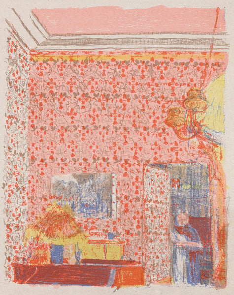
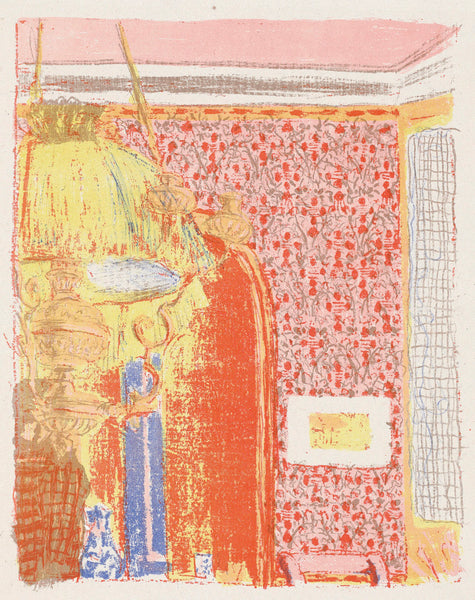
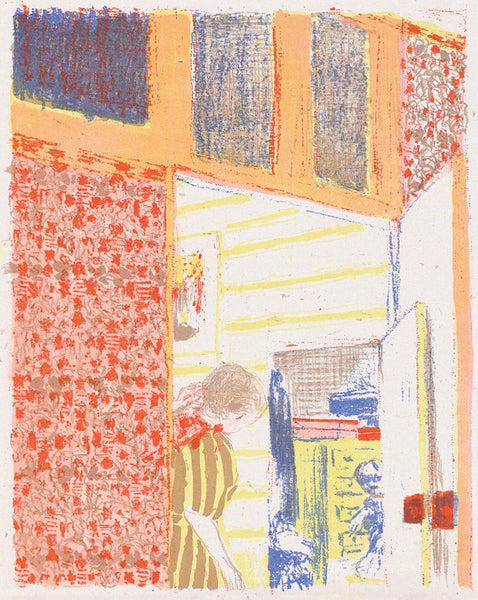
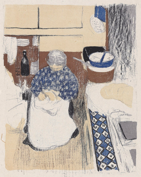
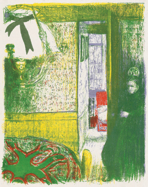
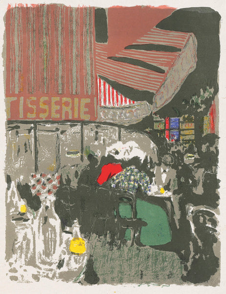
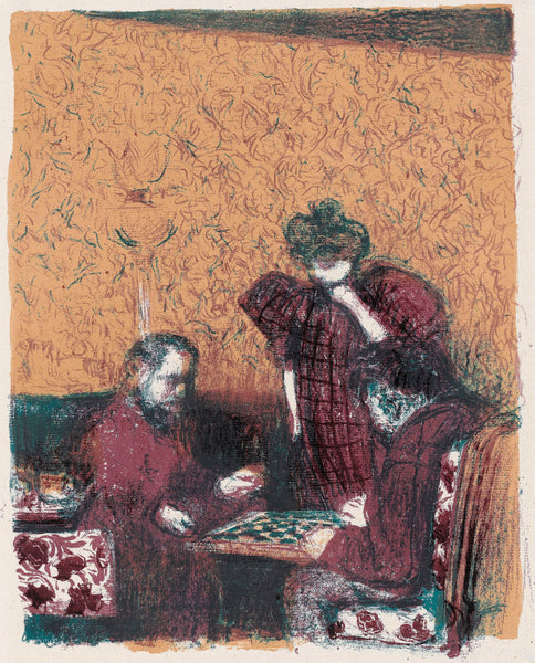
The first portfolio we will present is the one created by Edouard Vuillard, who was quickly becoming one of the most influential artist of his time in 1899. The set of color lithographs he created for Vollard is arguably one of the most important color print portfolios of all time. In it Vuillard rendered the life he painted in the streets of Paris, in its interiors, and in its surroundings, in a completely novel way. Each of these sheets is deeply indebted to the Japanese arts which had started to find their way into France in the 1870s and had become a collecting rage amongst art aficionados. Patterns, color juxtapositions, the flattening of space, the used of superimposed grounds… all of these effects were gleaned from Japanese printmaking and scroll painting, and adapted to a Parisian sensibility and esthetic. Each and every one of these prints presents compositions that were unusual and unexpected for contemporary amateurs. Today, these works of art still require from the viewers a level of concentration that is not easy to attain. These images don’t “read” easily. They require an attentive and analytical gaze. They are also, by that very nature, rich, textured, interesting and arresting. You may not “get” them right away, but you will also not be bored with them anytime soon.